visit website photoshopqu.com
Once upon a time there was a tutorial. A tutorial which told of magical and enchanting ways to create Fairy Tale pages in Adobe Illustrator. Are you sitting comfortably? Then we'll begin...
Final Image Preview
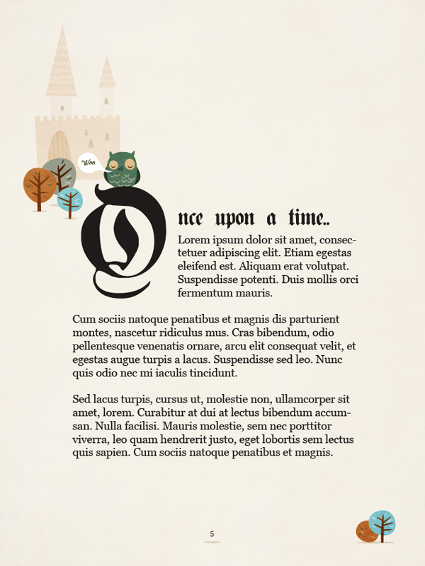
Below is the final image we will be working towards. Want access to the full Vector Source files and downloadable copies of every tutorial, including this one? Join VECTORTUTS PLUS for just 9/month.

Step 1: Setting Up The Document
Size is arbitrary for this tutorial; it's up to you to decide how large or small you want to work. For the sake of argument though, we'll work on a portrait page, roughly A5: 210mm high and 150mm wide.
With your artboard made, place a rectangle of the same dimensions on it and align it centrally.

Step 2: Guides
Call this first layer "guides" - that's all we'll be placing on it. Make a copy of the rectangle you've drawn (Command + C) and with the original selected go to View > Guides > Make Guides.

Paste the copied rectangle in place (Command + F) and offset it's path by -10mm (Effect > Path > Offset Path..). Now expand it (Object > Expand Appearance).

We're now going to split this smaller rectangle into a grid which we can use as a guide. Go to Object > Path > Split Into Grid.. and copy the settings as you see them below.

Splitting pages into multiples of three is usually a sound way to build good aesthetics. Having split the rectangle, select it all (Command + A) and using the same method as before, make guides from it. Make your artboard invisible (View > Hide Artboard) and your final grid should look like the image below.

Step 3: Layers
With the benefit of foresight, I can tell you in advance what you'll need for the document and how best to organize things. Make a few more layers and name them like you see below:
- "guides"
- "text"
- "texture"
- "illustrations"
- "background"
Toggle the locks and visibilities as you want while you're working.

Step 4: Background Layer
Let's give ourselves a background color, you should still have your original rectangle on the clipboard. Past it once again in place (Command + F), this time on the background layer and give it a fill color of #F2F1ED. Very good.

Step 5: Fonts
For the elaborate first letter and the introductory sentence you'll need a decorative calligraphic typeface.Plain Germanica from dafont.com is ideal. Download it and install it on your system. For the body text we'll use Georgia, or whatever serif system font you have available.
Lastly, while you're mucking around on dafont.com, download and install Ma Sexy - we'll need it later.

Step 6: Type Area
Use the Type tool and drag an area (using the guides to help you) on the text layer like you see below. Fill it with dummy text, color it with an off-black shade of #1E1B19 and size it to 11pt.

Step 7: nce Upon a Time
Add an initial few words Once upon a time.. but omit the O, we'll add this as a separate object later. Use the Plain Germanic Regular font for these words and make them slightly larger at 21pt.

Step 8: O
Use the Type tool and place a single, solitary O on the page. Make it 113pt, nice and imposing.

In order for the other text to wrap around it, we need only perform one action. With the O selected, go to Object > Text Wrap > Make. As you can see, the bounding box has taken on a kind of padding defining an edge around which text will wrap. In order for the text wrap to take effect, our O needs to be on the same layer as - and above the wrapping text. It's exact parameters can be defined in Object > Text Wrap > Text Wrap Options. We'll give our O an Offset of 10pt. Position the two type objects as you see them below.

Step 9: Illustrations
To give our page a truly Story Book feel, we need to furnish it with some slightly kitsch illustrations. We're going to use simple shapes and a limited palette, emulating illustrations from the '60's and '70's. We'll begin our Post-Modern-Kitsch-Nostalgic atmosphere (?) with a tree. Simple objects, all drawn with the Pen tool to give controlled irregularity.

Step 10: More Trees
Subtle variations of the colors you're using are available in the Color Guide palette (Window > Color Guide) and help to keep your palette within the boundaries we want. Draw a couple more trees and position them as shown. They should all differ slightly in form and color. Lovely.

Step 11: Owl
Q: Why did the Owl 'owl?A: Because the Woodpecker would peck 'er...!
My Grandfather told me that classic about 25 years ago... Anyway, I digress..
Keeping the same style in mind, draw simple shapes to build up an owl, we'll have him sitting on our O.

Step 12: Finishing Owl Touches
The feathers and the eyes are made with a little bit of warping. The feathers for example, can be made by firstly scattering a few ellipses of differing proportions on the owl's front.

With them all selected go to Effect > Warp > Arch and enter the values you see below:

Lastly, a whimsical speech bubble containing owl-ish thoughts will finish our owl. Use the Ma Sexy font you downloaded earlier for that kitsch-feel we're going for.

Step 13: Castle
A Fairy Tale illustration wouldn't be complete without a castle, would it? Copy the shapes and colors you see below and recreate them using the Pen and the Pathfinder tools.

The tiles pattern on the roof can be made simply with the Pen tool and then masked with copies of the roof points. If you need further practice at Pen tool techniques, download and have a crack at the VECTORTUTS Pen Tool Exercise.
Step 14: Arrange the Pieces
Group the castle objects together and give the whole lot an Opacity of 30%. Position the illustrative elements as you see them here; don't worry if bits drift outside of the grid, use your eyes to judge if the page is visually in balance.

Step 15: Added Extras
Include a fourth tree and a small bush at the bottom right of the page. Also place a page number (Georgia 7pt) with a small shadow centrally at the bottom.
 Step 16: Texture
The final touch for our Fairy Tale Story Book page comes in the form of some free paper texture courtesy of bittbox.com. Once it's downloaded, go to File > Place.. and place the file on your texture layer. With it in position, copy the background rectangle again and paste it in place (Command + F) over the paper texture. Select the two and press Command + 7 to mask the paper.

Finally, alter it's transparency to be Overlay 100%. This will give the illustrations - the whole page for that matter - a nice, rough grain.

Conclusion
This tutorial should have demonstrated how a few simple techniques can recreate a bit of childhood nostalgia in a modern, technological world. And we all lived happily ever after...

Subscribe to the VECTORTUTS RSS Feed to stay up to date with the latest vector tutorials and articles.