visit website photoshopqu.com

One of Illustrator's lesser-known functions is it's ability to produce and publish multiple paged documents in PDF format. Why is it a lesser known function? Well because applications such as InDesign and Quark Xpress are dedicated to producing such documents and it's unlikely you'll ever be advised to use Illustrator.
It is possible though, and in a pinch this technique may come in handy, especially when you're creating documents that are only a few pages long. This tutorial will explain how it's done, while discussing some grid layout theory to produce an Annual Report.
Step 1: Setting Up the Document
Having opened Illustrator, begin a new document (Command + N) and specify some settings in the New Document dialogue. Give the document a name of "report," select Millimeters for the Units, Landscape for the Orientation, and RGB for the Color Mode. Note: We've chosen RGB as this document is intended for screen viewing. If yours is likely to be printed it's advisable to select CMYK and ensure that the Raster Effects are set to the planned print resolution.
The size will automatically register as Custom as we enter our own dimensions. We need an Artboard three times as large as an A4 page (210mm x 297mm) to create three pages. We will therefore keep the height at 297mm but increase the width to accommodate 2 more pages (3 x 210mm = 630mm).
Click OK.

Step 2: Page Tiling
Go to View > Show Page Tiling.

You will see an area on your artboard which represents what we will be printing to a PDF file. This area could be any size, depending on your previous Illustrator Print settings.

Step 3: Setting Up the Page Tiles
We now need to adjust the tiles to give us our 3 A4 pages within the artboard.
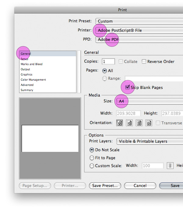
Go to File > Print (Command + P). You'll be presented with the Print dialogue, a sizable window with (legend has it) billions of options and settings. We'll just concentrate on those we need to setup our 3 page PDF document properly. Under the General section you'll need to set the following:
- Printer: Adobe PostScript® File
- PPD: (PostScript® Printer Description) Adobe PDF
- Skip Blank Pages: (ignores any blank pages, only printing those with content) checked
- Size: (size of the individual pages) A4
Step 4: Still Setting Up the Page Tiles
Now under the Setup section you'll need to set the following:
- Crop Artwork to: Artboard
- Origin: Both X and Y set to 0mm so the tiling begins precisely in the top left corner of your artboard.
- Tiling: Tile Full Pages
You can see in the preview pane how your document is progressing. You should now see that the artboard has been divided into three A4 page tiles.

Step 5: Save Preset
Once you have finished setting up your Print options you may find it useful to save them. Click on Save Preset and give your preset a name in the dialogue which appears. The next time we need to duplicate these settings you can select them under Print Preset.
Click OK to save the preset and then click Done (not Save) to return to your document.

Step 6: Hide Artboard
If your Artboard is currently visible you may find it helpful to hide it; we have enough lines on our page at this point. Go to View > Hide Artboard. You'll be left with a nice, clean, numbered, three paged area on your screen.

Coffee Break: Grid Theory
Structuring a layout with a predetermined grid has many advantages, particularly when working with multiple pages. This is true of print, web, in fact all design disciplines. Theories of grid-based layout design have been well documented for decades. Paul Rand was outspoken about graphic design theory and an advocate for the benefits of using grids in design.
The grid, then, is the discipline which frees [the designer] from the time-consuming burden of making certain decisions (dimensions, proportions) without which fruitful and creative work is extremely difficult. He can move directly to those aspects of the problem in which individual expression, novel ideas, and freedom of choice are essential."Design and the Play Instinct", Paul Rand, 1965
So, go and get yourself a coffee, take a look at some of the resources at the end of the tutorial and do yourself some research on using grids in design.

Step 7: Your grid
Precisely how you layout your grid is up to you; mine is based on six columns and six rows. Also, the following steps will define the margins and gutters dividing them.
Begin by placing a rectangle on your artboard. Give it the dimensions of an A4 page and align it with the first of your three tiles.

Step 8: Setting the Margins
With your rectangle selected go to Effect > Path > Offset Path and enter -12mm in the dialogue that appears. Click OK and then go to Object > Expand Appearance to expand your smaller rectangle.

Step 9: Finishing the Margins
Click on Command + K to bring up Illustrator's preferences. Set the keyboard increment to 6mm and click OK.

Now using the Direct Selection tool, drag and select the bottom anchor points of the rectangle, then press the UP arrow key once. This gives us an extra 6mm for the margin bottom of the page; good for aesthetics and also provides a small space for a copyright statement, pagination, etc.

Step 10: Setting the Columns, Rows, and Gutters
In print design, grids traditionally consist of columns and then gutters which divide them. Since the advent of web design and the use of grids for web layouts another approach has evolved. The nature of building a web page means that gutters are more a hinderance than help, so gutters are simulated by using padding and margins within elements.
Personally, I design more for the web than print, so I'm going to demonstrate what I'm more accustomed to. One advantage to designing with a web-based grid is that it allows your print document to be translated seamlessly for the web. If this all seems a little confusing, all will become clear...
While your rectangle is selected, go to Object > Path > Split Into Grid.

Step 11: Split into Grid
Illustrator makes it pleasantly simple to turn any closed path into a series of columns, rows, and gutters as you'll see from this dialogue. Enter the settings as you see below (click Preview to see the rectangle changing as you go) to create six columns and six rows then click OK. Notice that we've entered 0 mm for the gutters, as we don't want any in this case.

Step 12: Duplicate and Change into Guides
It's up to you how you duplicate the grid you've just made. Make sure you make two more and align all of them in the correct position on the tiles. Then select all three and go to View > Guides > Make Guides

All you have on this layer are your grid guides, so to make things easy on yourself, lock the layer and name it "guides."

Step 13: Colors
Using grids is all about limiting decision making (to an extent) in the design process. We're going to continue on that route by predefining our colors to save us having to think about it further down the line. By adding just two colors to the Swatches panel we will give ourselves a simple, but striking range for our document.
Click New Swatch in the panel or drag an object of your chosen color into the panel. I used the colors: Orange (#D8601D) and Olive (#A8A885). Once grouped in the Swatches panel, colors become available at varying degrees of tint, shade, muteness, warmth, etc. from within the color Guide panel. From here we can color everything in our document, without breaking our own rules.

Step 14: Getting Started with the Design
Make a new layer, call it "objects," or whatever you please. Use the Rectangle tool to create a rectangle covering the whole of the first page and another covering the bottom left quarter of the second page. Color them appropriately, as shown below.

Step 15: Text Layer
Make another new layer and call it "text." Copy the olive rectangle and then lock the "objects" layer. Select the "text" layer and click Command + F to paste the rectangle onto this layer in the correct position.
Using the same technique as earlier (Effects > Path > Offset Path), offset the path for this rectangle by -6mm and then expand it (Object > Expand). Give it a different color (of your choice) to make it more visible should you wish.

Step 16: Adding Text
We've made our rectangle within the larger rectangle, effectively giving us a container with (in CSS terms) 6mm padding which is acting as our gutter. We'll apply this "padding" to all the containers we build with our grid to continue uniformity.
Add some dummy text to the container by selecting the Type tool and clicking on the rectangle's path. Your rectangle will lose it's color and become a text container of fixed dimensions; it will neither expand nor contract irrespective of how much text you place inside.

Step 17: ...and Repeat
Repeat steps 15 and 16 to create a second text container next to your first. Remove the larger of the two rectangles and color the text differently to allow for a white background. You should really be able to see the effect of using "padding" as a gutter now.

Step 18: Stroke
Add a stroke using the Line Segment tool across the width of the grid, level with the centre-most horizontal guide. Color it according to your predefined palette and then nudge it (Up Arrow Key) once to move it 6mm upwards (remember having set the keyboard increment to 6mm in step 9?). Add another to the very topmost of the grid to create an area at the top of the page.

Step 19: Other Proportions
The flexibility of using a grid based on multiples of 6 is that both 3 and 2 slot nicely in. For this reason we can also divide the width of the grid into 3 columns, apply the same "padding" and it still looks visually acceptable. Create six containers, offset the path to apply the padding, and expand as shown.
Meanwhile, I've also added a title to the top of the page.

Step 20: More Dummy Text
Add some text to the lower area of the containers you've just made. These will be labels for the graphs we'll make in the following step.

Step 21: Graphs
Create a fourth layer, call it "graphs" and lock the others to avoid interfering with them. Now select the Pie Graphs tool and click on the artboard. Enter whatever height and width you please in the Graph dialogue which pops up, we'll adjust the dimensions later.

Step 22: Entering Your Data
A data entry panel will appear.
I'm not going to go into much detail for creating graphs with Illustrator - that's a whole other tut! However, I will briefly explain that each row of data here will create a separate pie graph. Each one will be proportional in size to the others with regard to the total of it's rows (in this case each row totals 100, so they'll be of equal dimensions). Enter the data like I've done and click Apply (the Tick at top right).

Step 23: Ungroup
Close the dialogue and ungroup (Command + U) the graphs. You'll be warned about losing editing features from the graphs if you ungroup them, but we're only interested in them as visual fillers here, so we can lose their dynamism.

Step 24: Color and Extrude
You'll have to ungroup the whole lot several times to fully separate the graphs, but once you have, give them some color from your palette, group each individual graph and apply a 3D Extrude effect. (For more on 3D Extrusion see the tutorial, Create a Can of Beans by Mapping Vectors to a 3D Object.)
Place the resultant graphs above their labels and don't be afraid to breach guides when you do so. Circles often need to be visually corrected when applied to grids, as someone very clever once said, "Rules are made to guide the wise and for fools to follow."

Step 25: Page 3
We've discussed most of the relevant principles regarding layout, so go ahead and use the concepts we've covered to fill the 3rd page up with some content. Again, place a stroke at the top of the grid, a second lower down and add two more columns for text, though this time taller. A large title and text area covering the width of the grid dominate the head of the page.

The table at the foot of the second text container is just a collection of rectangles, some text and a few aligned icons. White strokes divide the areas for clarity.

Step 26: CEO
Let's add a confidence inspiring CEO to our page. I downloaded an appropriate image (color coordinated tie!) and placed it on another layer under "objects" called "images."
Choose your own image and bring it into your document by going to File > Place. Select the file from your system and click OK. NOTE: Checking Link within the file selection dialogue will show the image in your document without embedding it. Should the linked file then be altered outside of Illustrator, changes will automatically be applied to what you see within your document. This helps reduce file size and processing time.

Step 27: Clipping Mask
Use the Rectangle tool to make a rectangle within the guides, stopping at the stroke as you can see below. This will act as our mask.

Step 28: Finish Image
With both the image and the rectangle selected, press Command + 7 to make a clipping mask. Use the Direct Selection tool to select just the image and rescale within the mask. Also, feel free to heighten the mask, again using the Direct Selection tool. Aim for something like you see below.
Add further text elements to complete a quote, using the guides to position everything and colors from the palette.
NOTE: Having placed our "images" layer under the "objects" layer, we've improved the bottom edge of the image with the stroke we placed earlier on.

Step 29: Final Touches
Nearly there! Just a couple of extra elements and we'll be set to print our PDF. First, a title and logo positioned like the image below on the front page.

Then a copyright statement and page number on the following two pages positioned just under the grid in our enlarged margin. Use the Glyphs (Type > Glyphs) to insert a copyright symbol if you want.

Step 30: Checking the Finished Report
Hide your Guides by going to View > Guides > Hide Guides (or hiding your "guides" layer) and check the overall aesthetics of your layout. Not bad? Good! Let's print it to file...

Step 31: Printing to File
Having completed your design work, go to File > Save As to bring up the Save As dialogue. Choose the location for where you want your PDF saved. Give it a file name (I used "report") and select Adobe PDF as the format, then click Save.

Step 32: PDF General Settings
You'll be presented with the Save Adobe PDF dialogue in the General settings. Play around with options as you wish, but what's important here is that we set:
- Adobe PDF Preset: Smallest File Size
- Optimize for Fast Web View - Check
- Create Multi-page PDF from Page Tiles - Check
The Create Multi-page PDF from Page Tiles setting is of course crucial, if you fail to check it, you'll create one PDF page consisting of your whole artboard. Not the goal we're looking to accomplish.

Step 33: PDF Security Settings
Go to the security settings within the Save Adobe PDF dialogue. Settings here will determine what users may or may not do with your document. Check Use a Password to Restrict Editing Security and Permission settings. In doing so, you'll be allowed to secure certain things with a password. We're going to:
- Disallow printing (it's a low resolution, RGB document for screen viewing).
- Disallow changes (We don't want people editing the data in the document).
- Disable copying of text, images and other content (I'm feeling mean, I don't want large chunks of text copied and used elsewhere).
Set these options as you want them and click 'Save PDF'.
 Conclusion
Finished! Take a look at the final PDF (no, you can't edit or print it!) and check that everything has turned out as expected. One thing to pay attention to is that content hasn't flowed over into other pages. In this case, the orange of the first page could easily be just skimming the left edge of the second page. Make corrections if needed and save again.
At this point, I want to reiterate that this technique is not a replacement for using software dedicated to page layout, such as InDesign or QuarkXpress. This technique can be effective when you need to create short multi-page documents though.
We covered a wide range of skills in Illustrator to produce this document, some extensively, some which will require you to go and investigate further. Have fun doing so!
Resources
Visit paul-rand.com - for more thoughts and work from Paul Rand.
Mark Boulton's Grids Are Good is an excellent PDF article for those interested in furthering their knowledge of grid-based layouts.
For a comprehensive resource list see Smashing Magazine's Designing with Grid Based Approach - the reason why this resource list isn't very long; it's all here!