visit website photoshopqu.com
This tutorial will cover the techniques used to create see-through information graphics. You'll need a strong familiarity with Adobe Illustrator's Pen Tool to complete this tutorial.
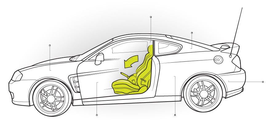
Final Image Preview
Here is the final effect we'll achieve. Click this link for a larger version.

Step 1
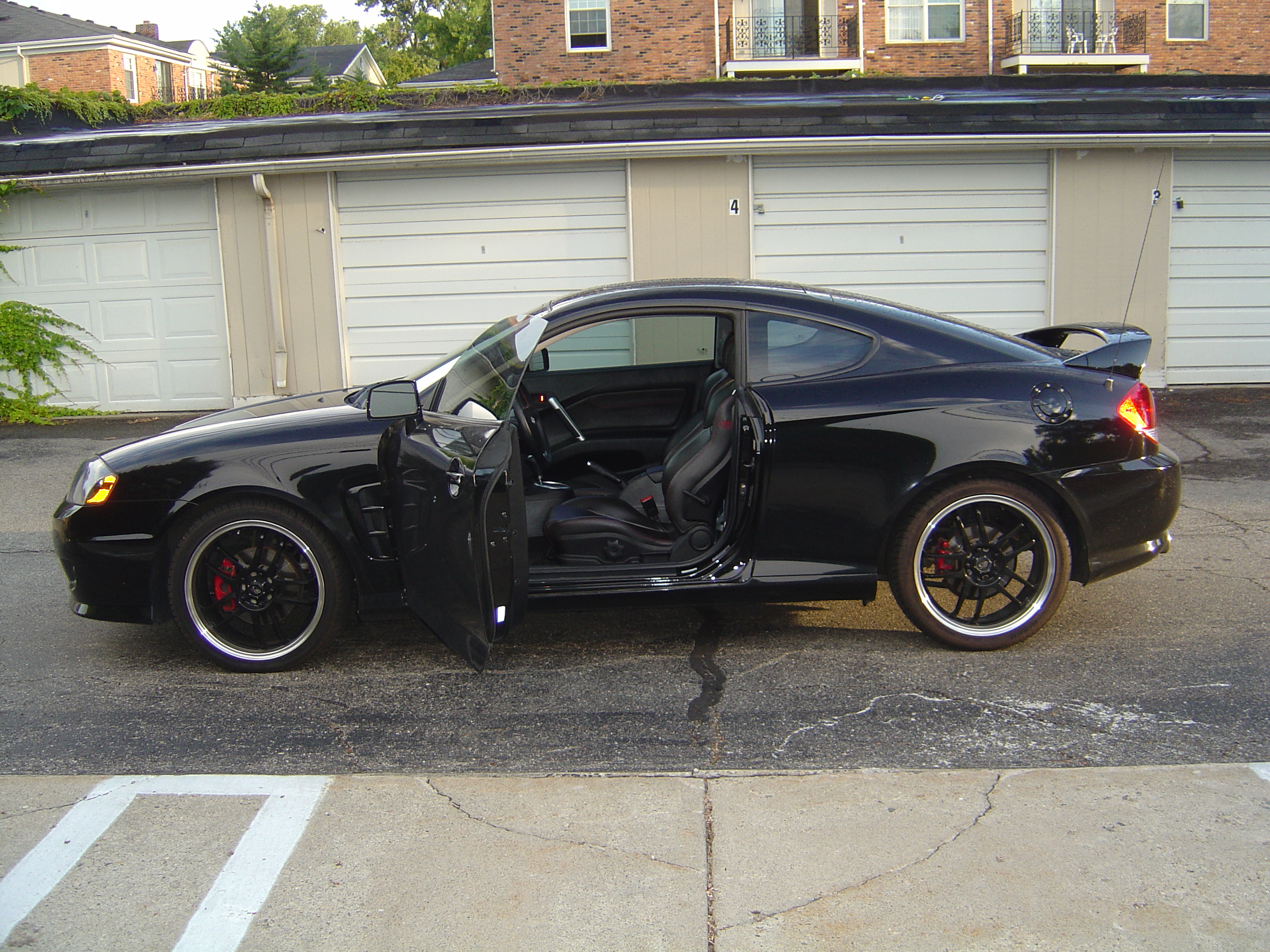
We'll start by taking two photographs of an object. The most important thing to consider when choosing your subject matter is that it needs to be seen in two different states. The car will first have its doors closed, and then open. Use a tripod if you have one so both photos are taken from precisely the same angle. Here is the first source images I shot for this tutorial door closed image.

Step 2
The second photo will be the altered state of the object. Photos taken at a higher resolution tend to work better since we'll need to zoom-in when we're tracing details. Here is the first source images I shot for this tutorial door open image.

Step 3
Before we put our photo in Adobe Illustrator we will need to layer them on top of each other in Photoshop and simply erase the portion of the photo where they are not similar. In this case, it's the door area. Here is the edited layered source image.
.
Step 4
The effect we're trying to achieve is one that shows a detail of the interior seats.

Step 5
Place your photo in Adobe Illustrator on its own layer and lock the layer. Use a bright color when tracing your object so it's easy to see what you're doing. Select the Pen Tool (P) and trace around the whole object, to establish its general shape. The thinner the line weight, the easier it is to trace details. Use about a 1 point line weight.

Step 6
Use your own discretion when determining how much detail to add. For example, when tracing the windshield wipers I did not highlight every detail.

Step 7
Follow the shapes as best as you can, however, they do not need to be perfect.

Step 8
Occasionally turn your photograph layer off so you can see how much progress you've made. Click this linkfor a larger view of the photo.

Step 9
Notice that I did not fill in every single detail when drawing the seats.

Step 10
The ends of all your lines should be blunt. This will make it easier to give the illustration a completed look when we get to that point.

Step 11
Once you're done tracing all the shapes, you can turn off the photograph layer. Right now the car does not look very impressive, but that will change as soon as we add line variation. Line variation gives the illustration depth and interest. You can add line variation while you're drawing each section of the car, but I find it easier to do this after everything is drawn.

Step 12
If your basic shapes are not already the thickest part of the illustration, then select them and give them a couple points thicker weight. In general, your line weight will range approximately four or five points for the entire illustration.

Step 13
Again, lines that should be the thickest are lines that are major shapes, lines that should appear closest to the viewer or lines that need to stand out. This process is a combination of creativity and logic.

Step 14
Notice the variation in line weight between the seats. The edges of the seats have thicker lines than the other parts.

Step 15
See how the windows have a thinner line? This is because they are farther away from the viewer, or should not garner as much attention.

Step 16
Here is what your illustration will look like when you have the various line weights established. Doesn't that look much better? Make sure all of your line weights are as you want them because you cannot change your line weights after this next step. Click this link for a larger version of the image.

Step 17
Select everything and go to the top of the screen and select Object > Expand... When the dialog box appears press OK.

Step 18
Now that all of our lines are expanded we can clean up the blunt ends of our lines. Use the Direct Selection Tool (white arrow), select one of the points at the end of a blunt line, and drag it on top of the point right next to it. This will make the line look tapered and finished.

Step 19
The tapered lines are also important because they enhance the illusion of being able to "see-through" one part of the illustration to the object below. A line that ends bluntly suggests the object has a hole cut in it while the tapered line implies a gradual change.

Step 20
Repeat this process for all of the lines in your illustration that end abruptly.

Step 21
Notice how the door looks like it gradually becomes transparent. This is because the lines taper down to a point.

Step 22
Add some color behind the focal point of your illustration. It's easiest to add the color on it's own layer.

Step 23
Add a gradient behind the color and put that on its own layer too. The gradient will give the impression of depth.

Step 24
Feel free to include any symbols that are instructional, this adds to the illustrations interest. The arrow can be used to depict some kind of action, like the ability for the seat to move in the car There is no real rhyme or reason for the arrow here, as this is just an example. It does fill the negative space nicely though!

Step 25
I've added a subtle gradient behind the car as well, to anchor the car slightly. The key is to add your gradients in moderation. You want to keep the focus on the object not the gradients.

Step 26
Add lines, numbers, or any other symbols that will enhance the illustration. These callouts are used to explain the details you need to highlight.

Final Image
Here is what the completed illustration looks like. You can apply this technique to many objects. Depending on what effect you're going for, you can take three or four photos and make several layers of transparency. Just get creative and have fun! Click this link for a larger version of the image below.